The first two lowbrow illustrations I did for the japanese alternative rock band Domico
Domico is an alternative/indie rock band from Japan. First off, here’s a quick link to their Spotify page, and also a link to their store, since it’s packed with a lot of lowbrow, cartoonish skateboard inspired graphics we did in the past 3 years.
Let’s start from the beginning, Yuuki texted me in 2021, asking for an artwork for Domico’s track “SARU INU KAWAZU UMA”.
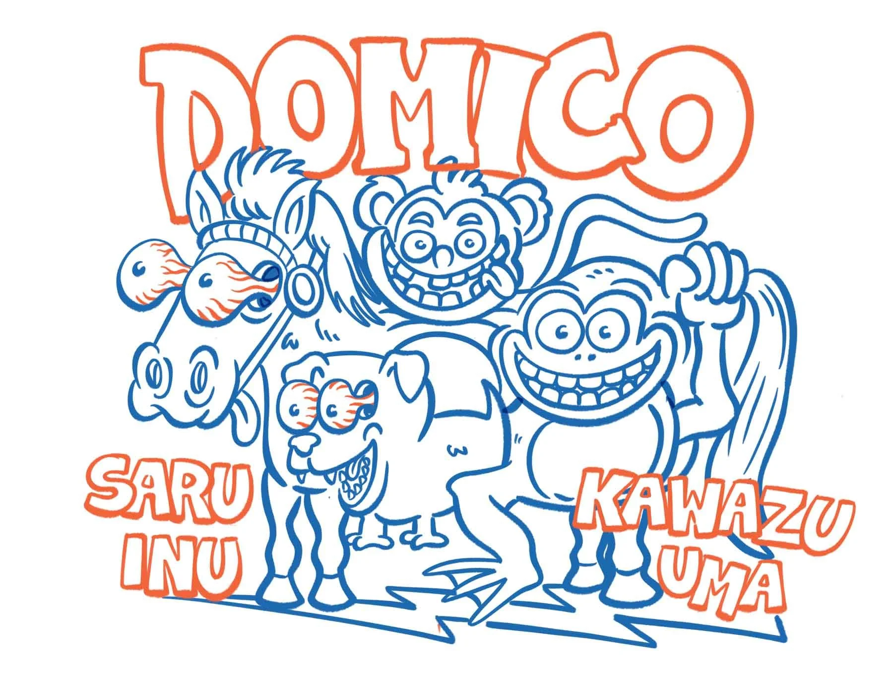
SARU means monkey, INU means dog, KAWAZU means frog and UMA means horse. So basically I had to draw a mix between these animals. Here’s the first, super quick sketch:
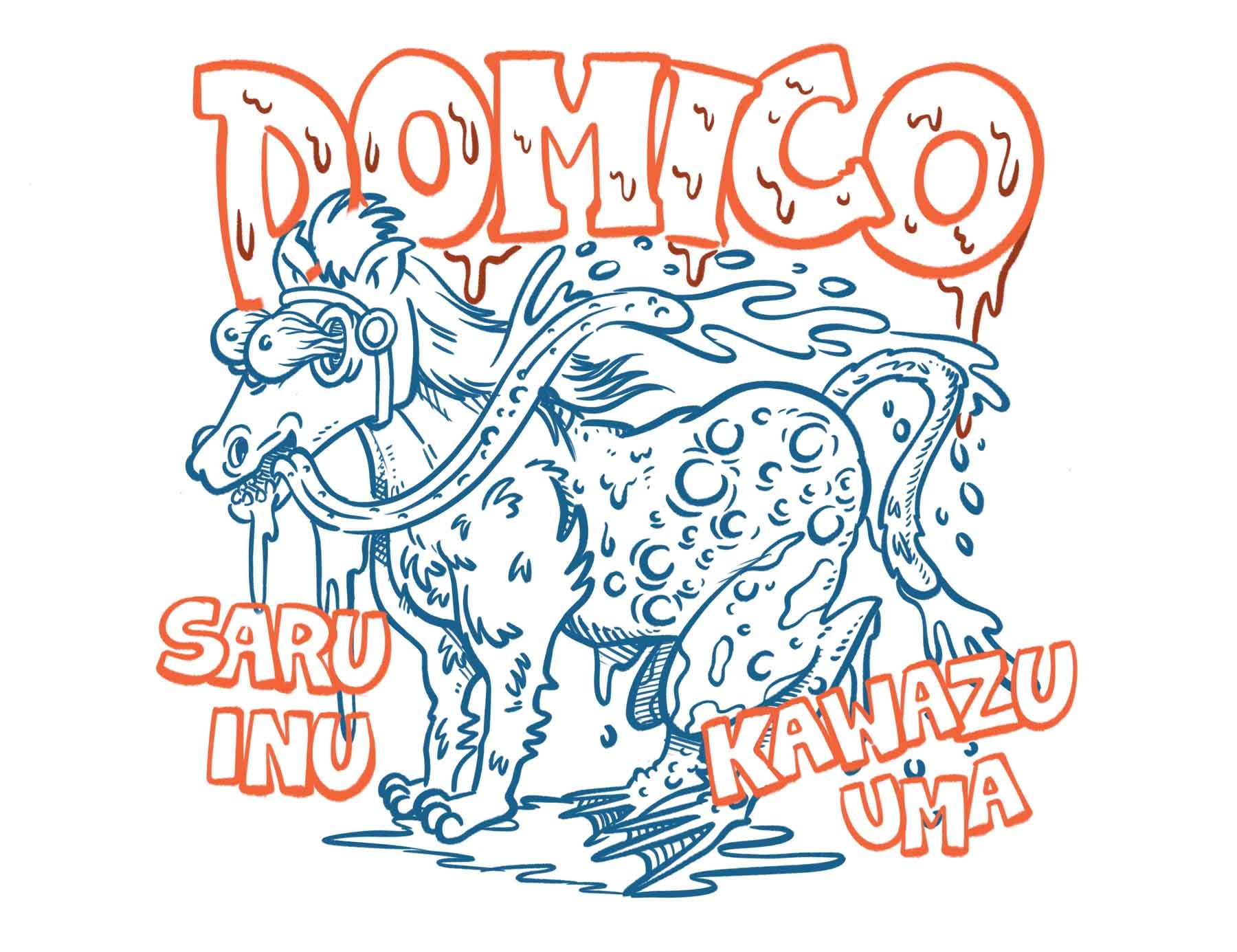
We nailed the text and the overall layout, but the animal should have been more like a Chimera, an actual mix between all the animals in one body. Here’s the second one:
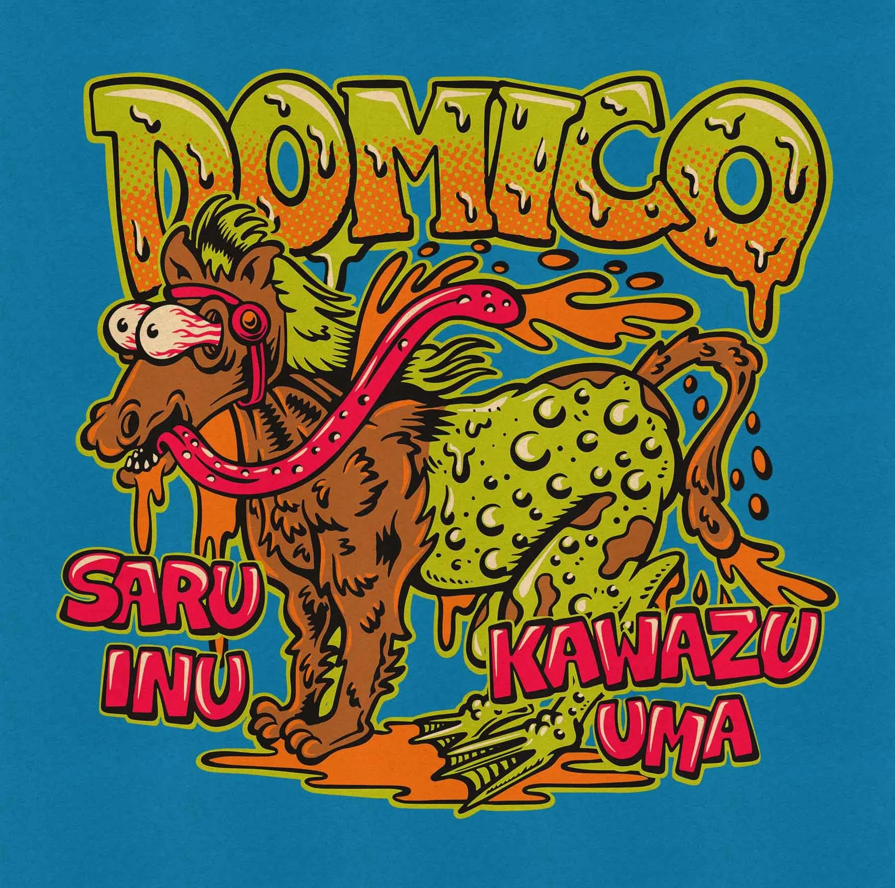
This one got approved, so I worked on the inks & colors and as you can see there’s an horse body, with dog legs on front, frog legs and skin on the back and a monkey tail.
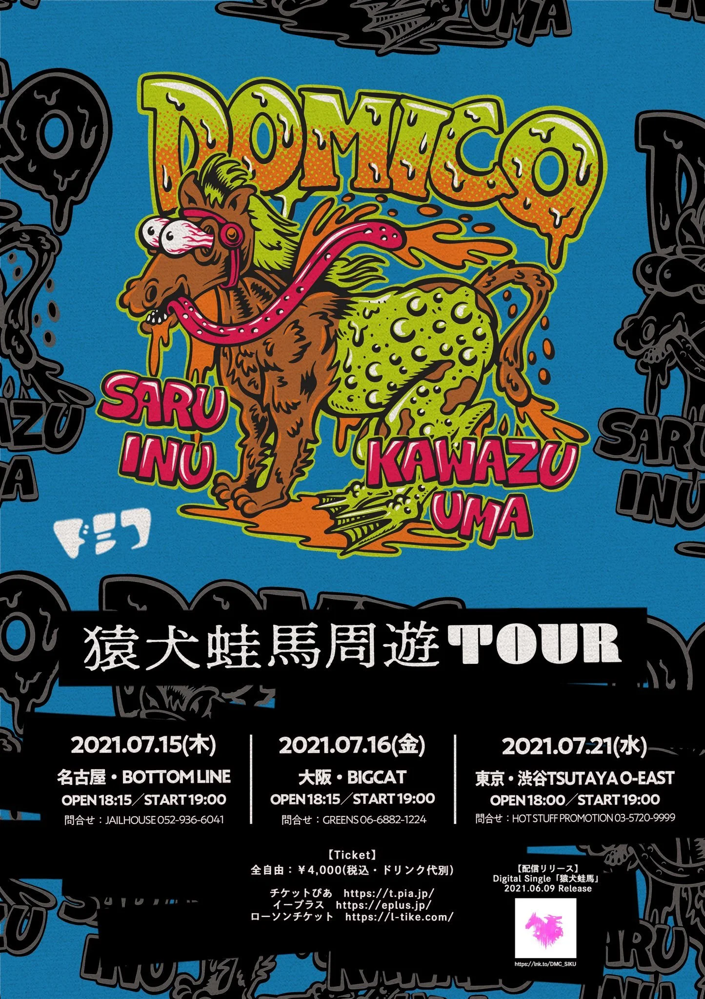
The color palette it’s some sort of acid mix between cold and warm colors, eye popping like one of those vintage skateboard stickers from the 80s. Here’s a couple pictures of the artwork on stage and on the poster:
After drawing the first graphic, we started the second one right away. I was pretty happy about that! We talked about some buddhist paintings and nice frames looking at a couple of visual examples as usual, so the idea was to bring some of the details ( in this case it was the faces/skulls frame around the characters) into something more aggressive, lowbrow and skatepunk connected. Yeah pretty much what I do for a living, basically. Here’s one of the reference pics they sent to me:
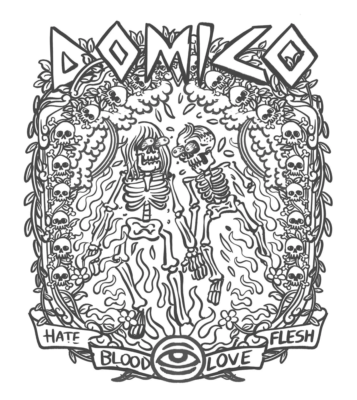
Pretty sick ah? I looked into it, and they seems to be two protective deities, a man and a woman pictured as two dancing skeletons. Painting’s from Tibet. Here’s the first sketch anyway:
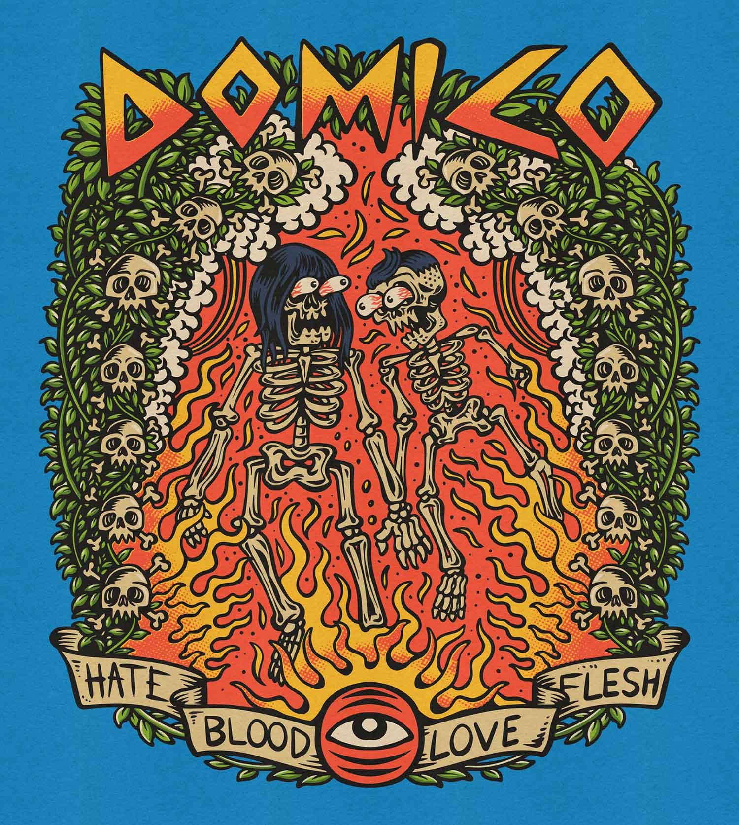
The idea here was to bring some of the mystic vibes of the two tibetan deities reference to something new. The two skeletons are the two members of the band, the singer/guitarist and the drummer. Fire is coming from the bottom and they’re burning on it, we can find some red and yellow rainbows at the top coming out from the clouds, all surrounded by a frame made by leaves and skulls. At the bottom on the scroll we can find a couple cryptic words.
The guys loved the concept, and after a couple rounds of very tiny fixes, we got it. Here’s the final art. If you’re thinking about that nice paper texture on it, it’s from True Grit Texture Supply.
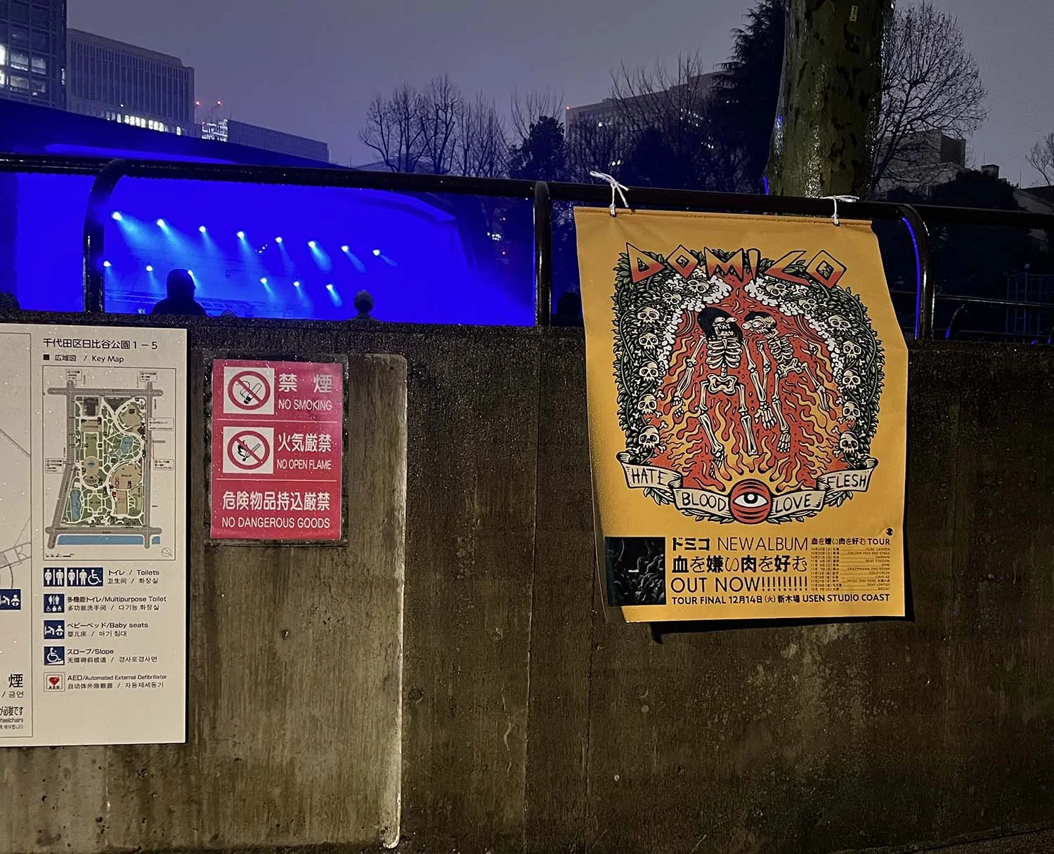
Now, unfortunately I found just one a picture of the poster.
These were the first two artworks I did for Domico, but we worked on several designs together, and the art have been used as a big stage background many times during their Japan tour. Curious to see more? Stay tuned for the next article!
Also, if you’re still thinking about commission me an artwork, here’s a quick article about how i usually handle a commission job, or you can just text me at info@joetamponi.com!
As you can see taking a look at my website, there’s plenty of things we can do together: from a classic sticker design (usually a more minimal graphic with thicker lines and big solid texts) to big composition with a lot of trippy, cartoonish weird characters, to make your product/shop/business/branding like it’s straight out of a skateshop in 1993, with punkrock playing in the background and a bunch of skateboards, cool vintage ads & sick stickers all over the place.

