Step by step: drawing a couple of t-shirts graphics in a lowbrow kustom kulture style for Bobber Cycles
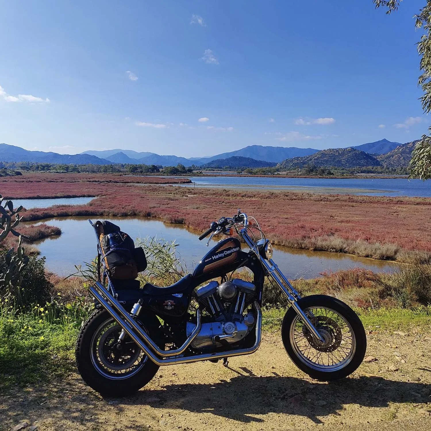
A couple of years ago, I handled a commission with two t-shirt designs for Bobber Cycles, a custom garage close to where I live. In 2020 I bought a stock 883 Xl Sportster, thinking about doing a 70s style kind of chopper with it. In the beginning it was trash, they transformed it. I talked with the guys several times, exchanged ideas & pictures and after a couple of back and forth, they did a fenomenal job. I mean:
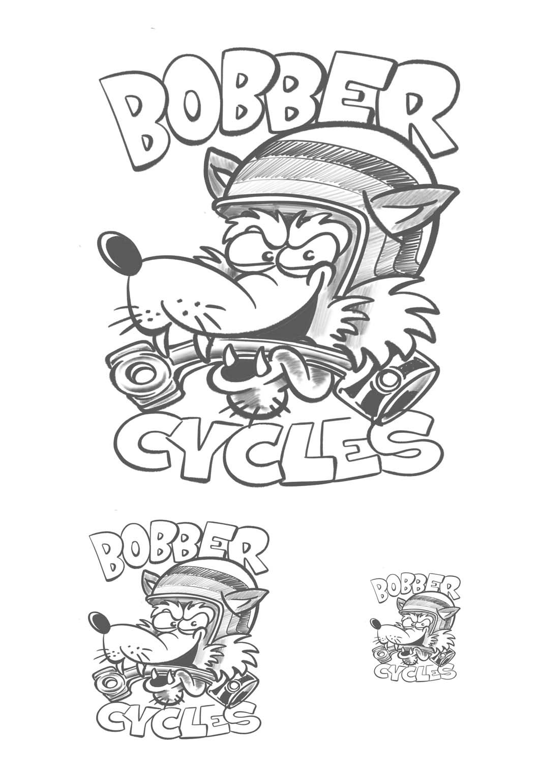
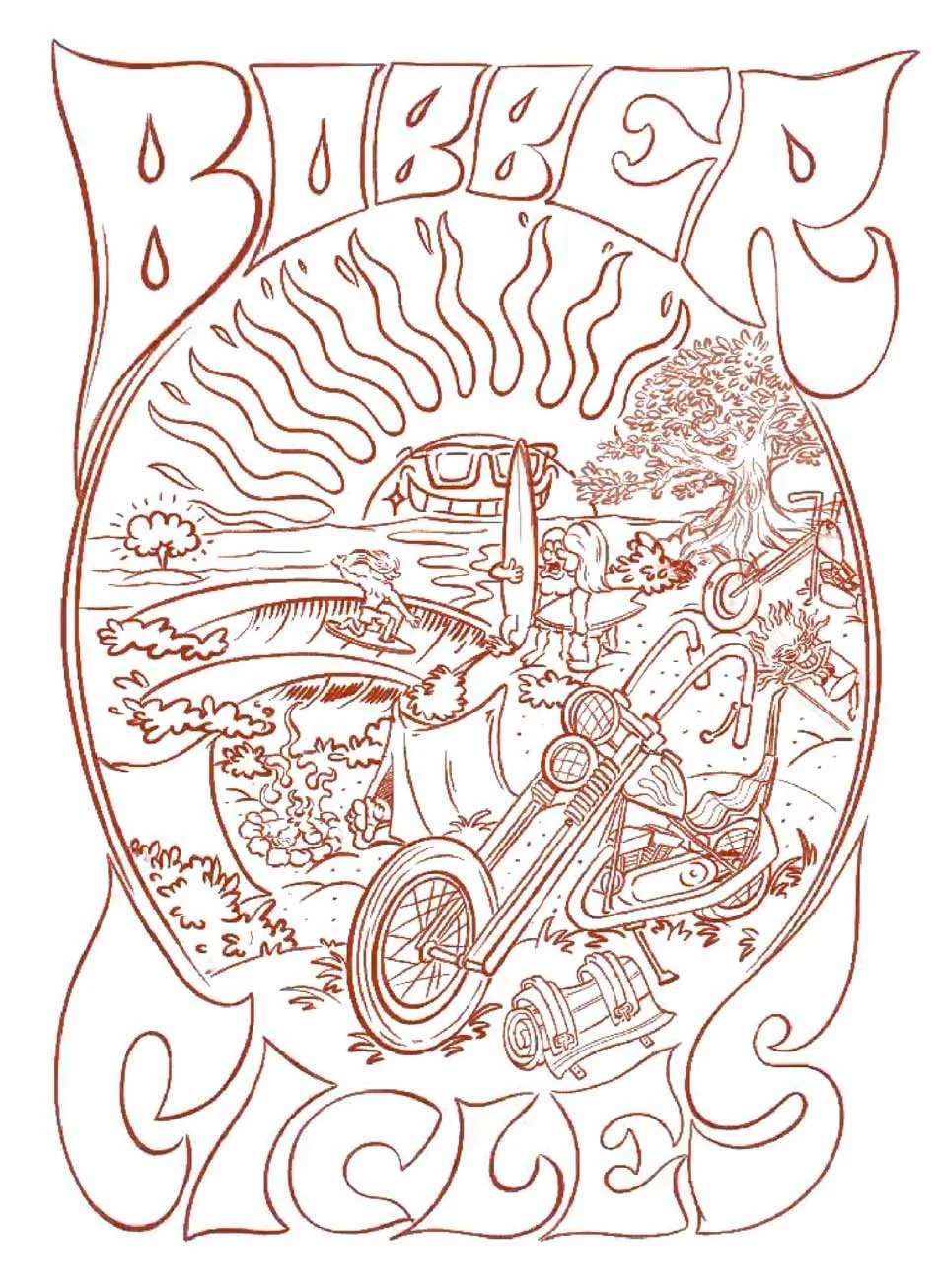
I was pretty stoked about the result so when they asked me to work on a couple graphics I was super, super in. The brief was quick, I had to handle a more minimal, fun graphic with a wolf wearing an helmet, and a big 70s inspired composition picturing a motorcycle camp site in the West coast of Sardinia, super close to the beach. Something that screams freedom out loud, ya know? Here’s a couple sketches:
The idea was to have this big wolf graphic on the back, with a small blocky Bobber Cycles text as a small heart print.
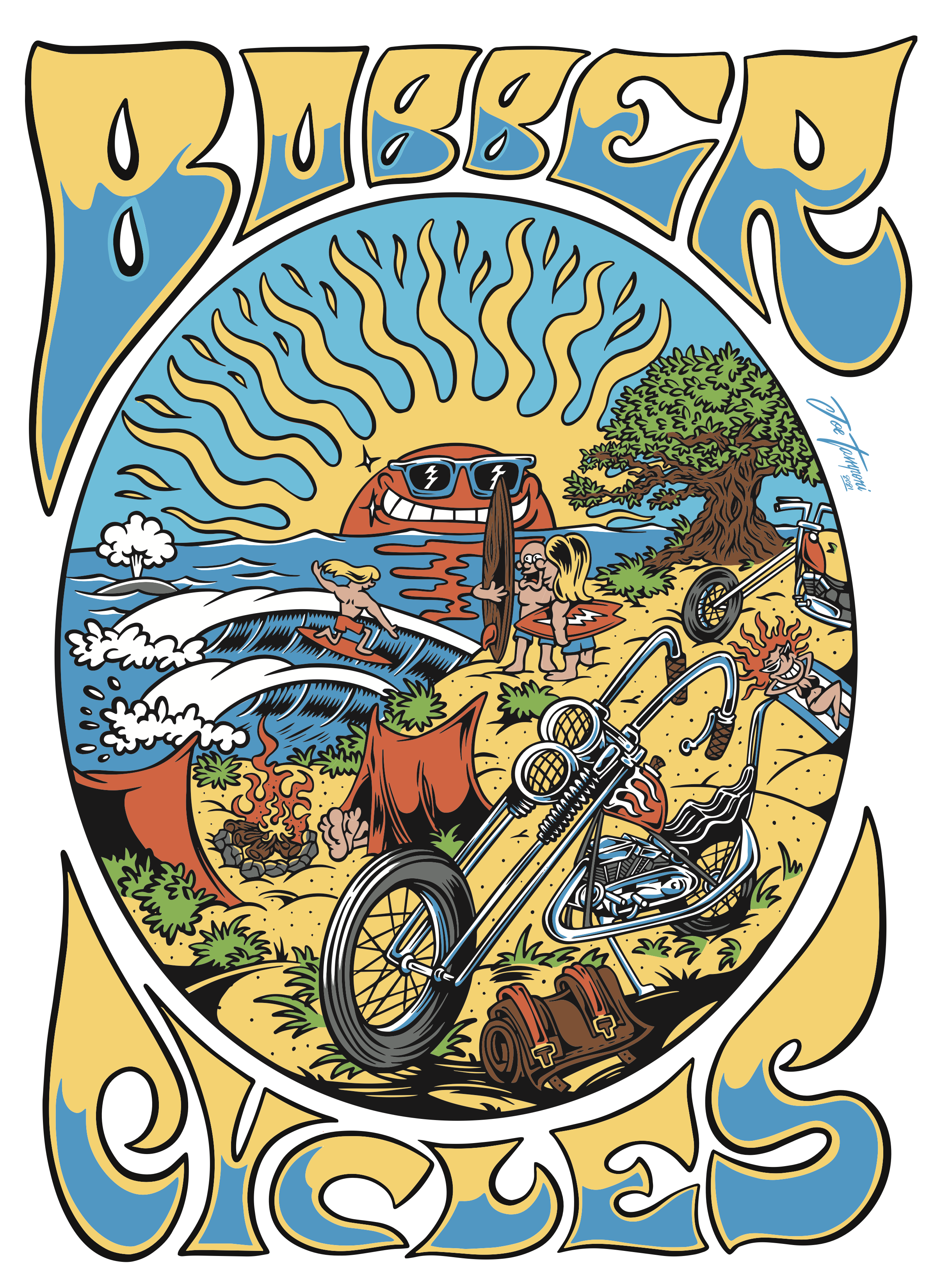
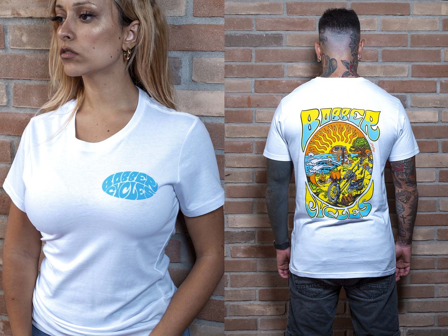
The second graphic was definitely harder. I started drawing inside the oval, sketching the Harley chopper bike on the foreground with a small tools bag, a firepit right behind it with a couple surfers talking about the swell. On the background, a sick left wave breaking. Maybe you’re wondering why there’s no palm trees around right? Well, we thought about a specific beach here in Sardinia, and there’s no palm trees over there. But all over the island, you can find a lot of olive trees.
Then I started building the psychedelic text on top and bottom to frame the whole thing. If you’re familiar with old vintage posters from the 60s that kind of wavy shapes is gonna look familiar to ya, well, I tried.
Let’s see the delivery files together:
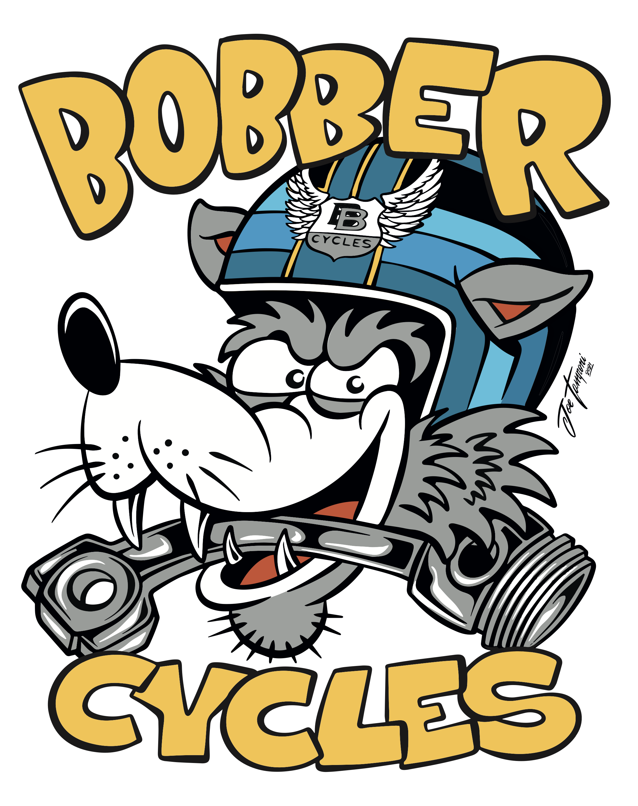
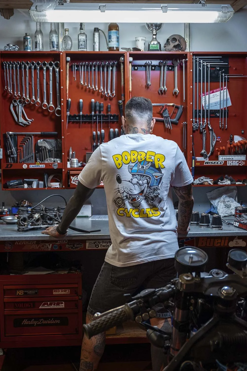
A big bad wolf with a helmet and a piston in his mouth. Cool right? Color palette’s pretty clean, yellow with white and “medium” light grey. We put a Bobber Cycles logo on the front of the helmet as well.
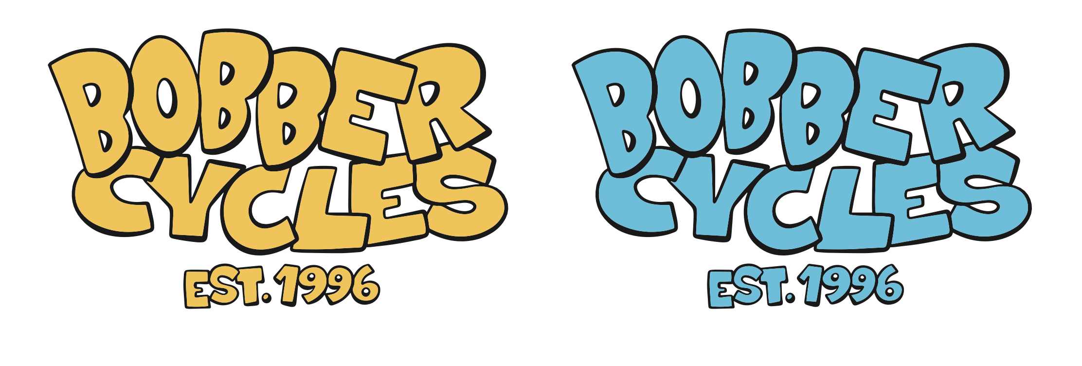
And here’s the blocky text for the heart side print.
We kept pretty much the same color palette but adding red, brown and green. It’s actually more of an orange right? Look at some posters, comics and covers from the 60s and see, how many dark oranges you’re gonna find, instead of a bright red?
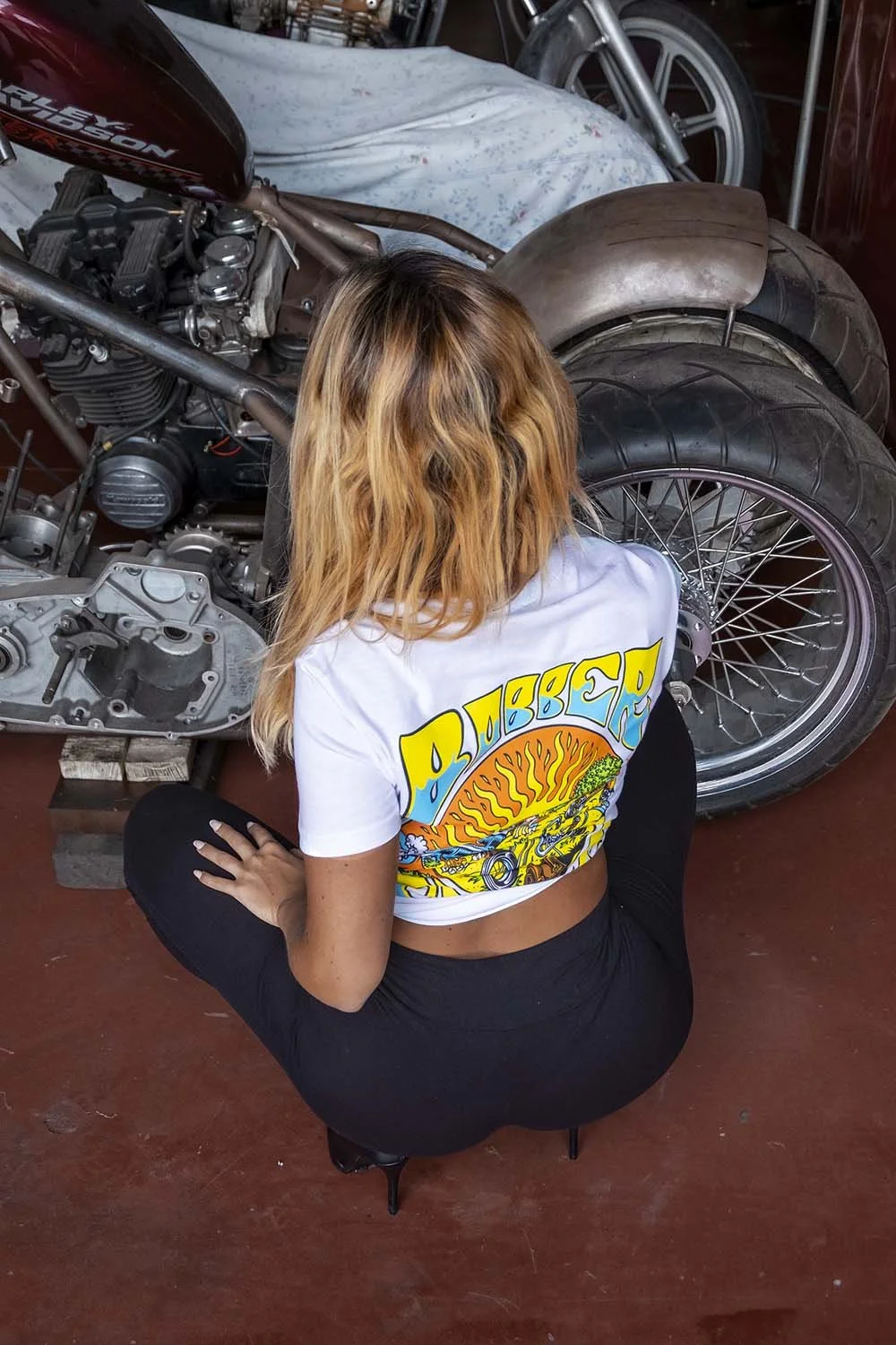
Let’s see some pictures of the printed tees, to see how the graphics are gonna look when they’re printed. All the pictures are done by Ernst Cabròn, Erotic & Heretic photographer deep-fried in girls, motorcycles and country stuff. The guy’s work is fucking sick.

