
A surf graphic for Osprey Tacos!
This one's for a new client — Osprey Tacos, a taco spot based in St. Augustine, Florida. I pitched a couple ideas to them, then we decided to create an Osprey surfing a wave while eating a taco. I remember me thinking “ yeah this is gonna be f**** fun”
So I put together a quick sketch with the bird riding the wave, taco in hand, and the Osprey Tacos lettering placed above and below. I added two palm trees on the sides to frame the whole scene. It’s a super rough and fast sketch, but I wanted to give the client a first visual taste of the concept.
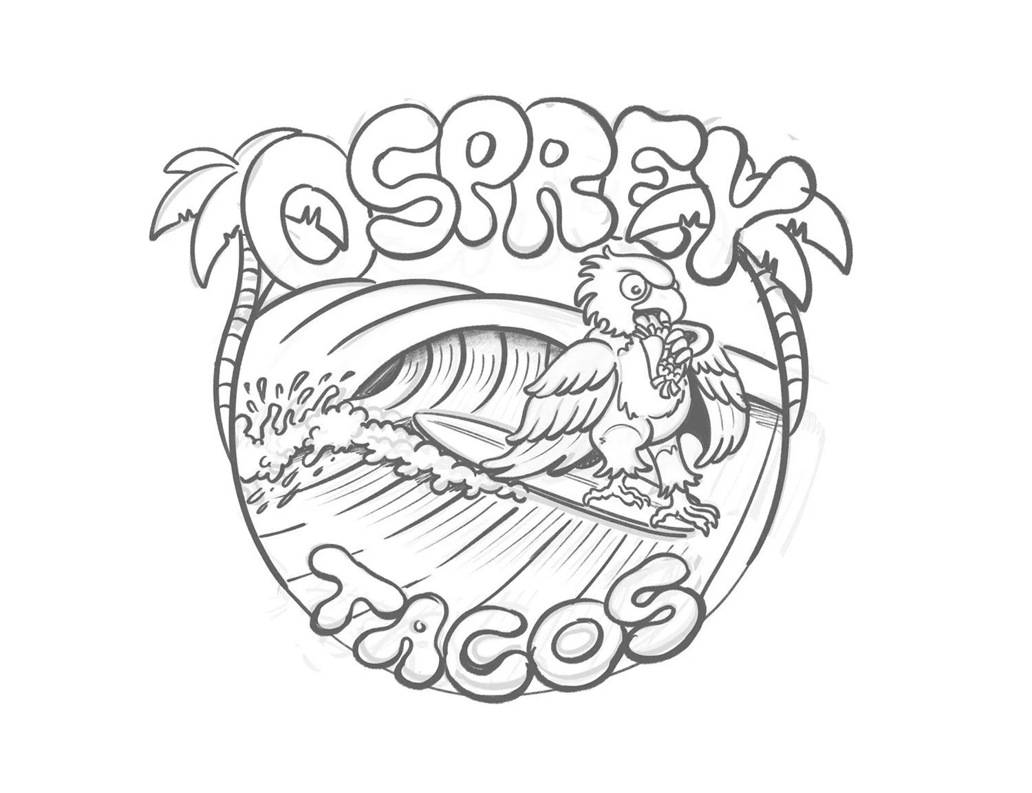
Osprey Tacos - first sketch
After talking it through with the client — who really liked the first sketch — we decided to level it up a bit.
We added a couple of elements that are iconic to the city: the lighthouse up on the left, and on the top right, the Castillo de San Marcos, the historic fort of St. Augustine.
I also tweaked the position of the wing holding the taco to make the pose feel more natural, and added St. Augustine, Florida at the bottom of the design. In the second sketch (on the right), I decided to include a local flower — the Blanket Flower — to wrap around the lower part of the design with its petals and leaves, adding that last touch of local character to the whole piece.

Osprey Tacos - second sketch
This sketch ended up being the final one, so I moved on to inking and coloring. I went with a warm palette — I love using this sunny yellow that feels really rich, and paired it with a light blue for the wave and a cool green for the palm leaves and the foliage around the flowers at the bottom.
To nail the gradient of the Blanket Flower, I used a halftone dot pattern that fades the color from the center outward toward the petal tips. The whole graphic was designed with dark-colored shirts in mind, so I added an outer outline in the same blue as the wave. That way, the original color scheme pops even on a dark background and stays clean and balanced. Here’s the final!

Osprey Tacos - final
Cool right? Hit me up to info@joetamponi.com and let’s chat about a piece!