Rizzlers, skateboard art style into a vape cannabis brand logo
Rizzlers is a vape brand by Motif Labs, a leading cannabis brand house in Canada, proudly holding top market share positions in vapes and infused pre-rolls.
As usual, the beginning of building this logo has been a mutual exchange of visual examples and references. The instructions were to draw a 90s skatepunk vibe, without beeing too “angry”, but with the colorful poppy side of it. A couple visual references sent by the client:


Other than that, a playful oozing/dripping font, connected to the fact that the vapes are filled with oil with juicy, sweet flavours.
Rizzlers - First sketch
Here’s the first sketch. Drippy for sure, maybe even a bit too much. Since it’s a logo, we should avoid something too detailed. Should be clear, visible and readable from any distance and easily recognizable.
Rizzlers - Second sketch
So I went over it, drawing on another layer simplifying the whole thing. Slightly thicker lines, less drips. The client liked it, and we went on the next step.


Beside from all the “simplify to get a clear logo” thing, it’s common that during the sketch step the lines are thinner, it’s easier to manage a thin line, you’re gonna have more room to play with.
I’ve tried several color variations/combinations. After confronting with the client and his graphic team, we come up with this version as the final.
Rizzlers logo
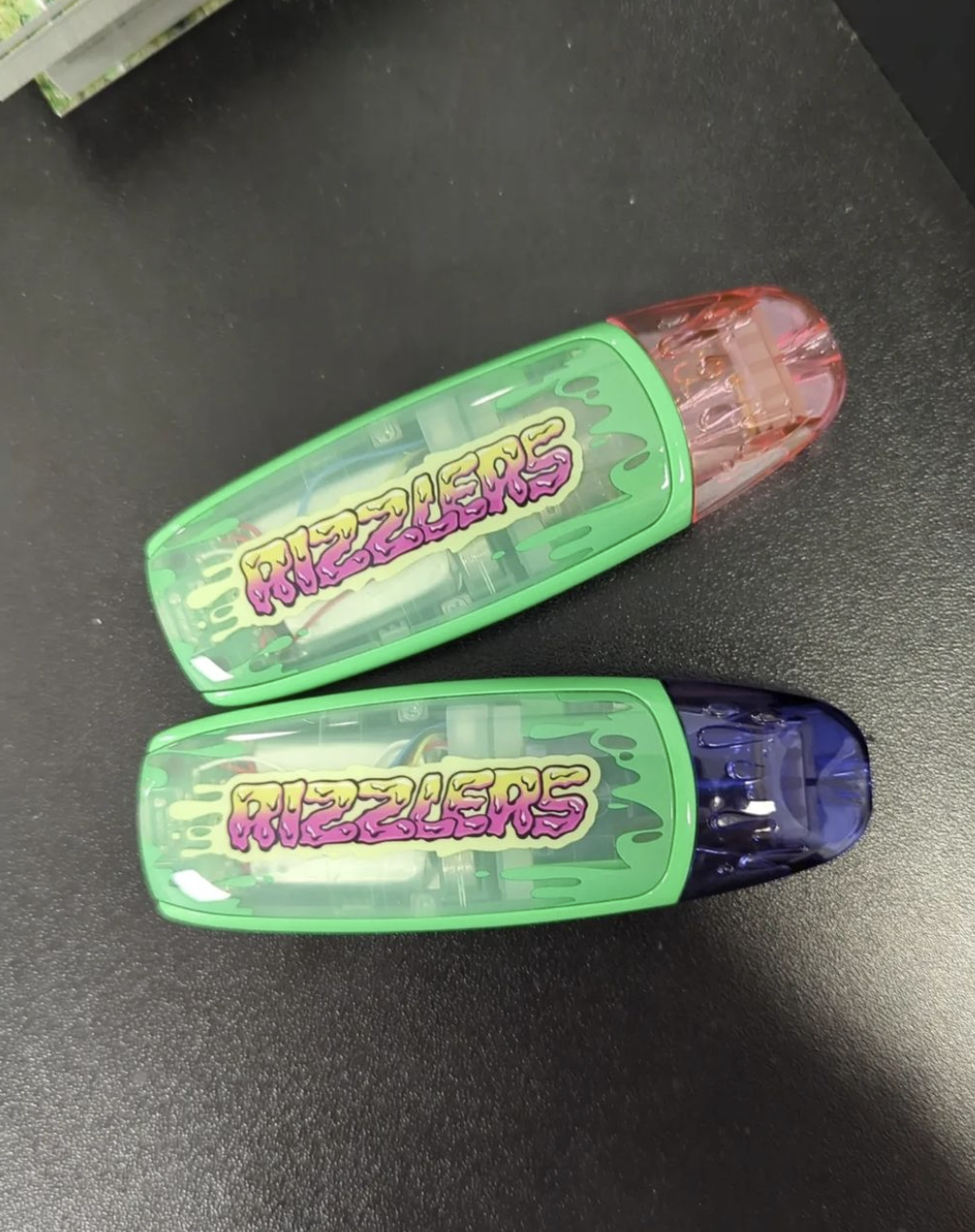
Bright, colorful, makes you think a bit about an old bubble gum label but also an old skateboard graphic.
If you wanna see more, take a look to their website: https://www.rizzlers.com/.