Some beer can designs & illustrations, microbrewery in a lowbrow art style
Working and illustrating a packaging is fun. really fun. The idea to create something that should be super eye catchy to get the attention of someone that it’s just looking at shelves full of beer cans is exciting.
Chatting a little bit with Matt, we brainstormed a couple of ideas for a collection of beer cans. The main goal was to create an eye catchy, super colorful bright design.
The whole concept behind these and basically my whole production, is to make the product look like’s out from a skateshop in the late 80s. Bright colors, bold lines, sometimes super aggressive sometimes funny, with some stoner vibes from time to time.
Gummy Tango - Beer can design
Gummy Tango was a weird one. I had to draw this small ballroom with a bunch of gummy bears dancing, with this gummy, rounded bold text. Kinda Trippy.
Oakdale Bud
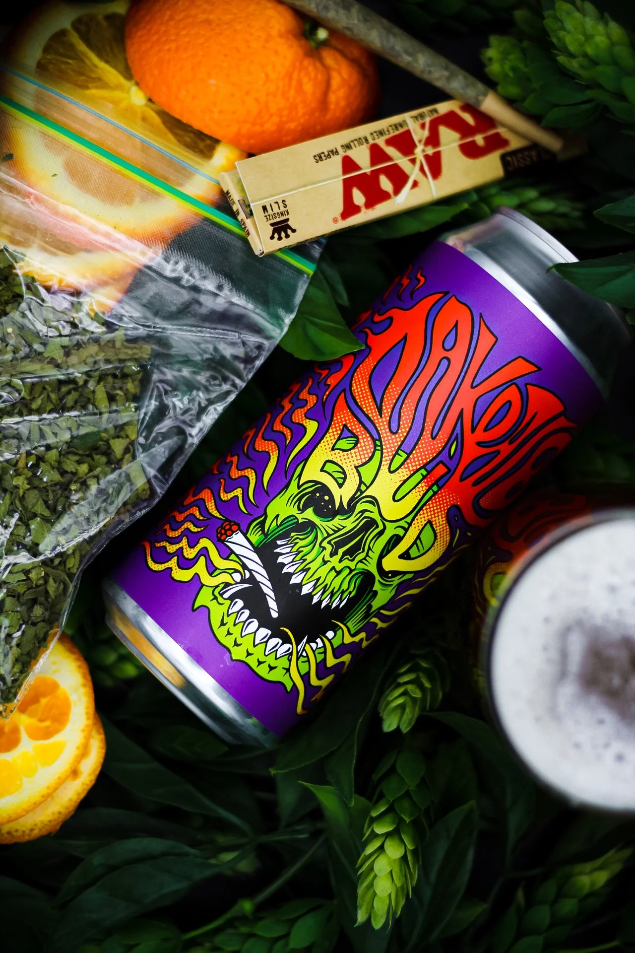
Oakdale Bud was one of the easiest. The idea was to make this smoking skull with a joint in his mouth, but then I had to fit the text somewhere. Then I thought about him tripping, and the text could have been something coming out from his eyes, super trippy & psychedelic.
Saabro - beer can design
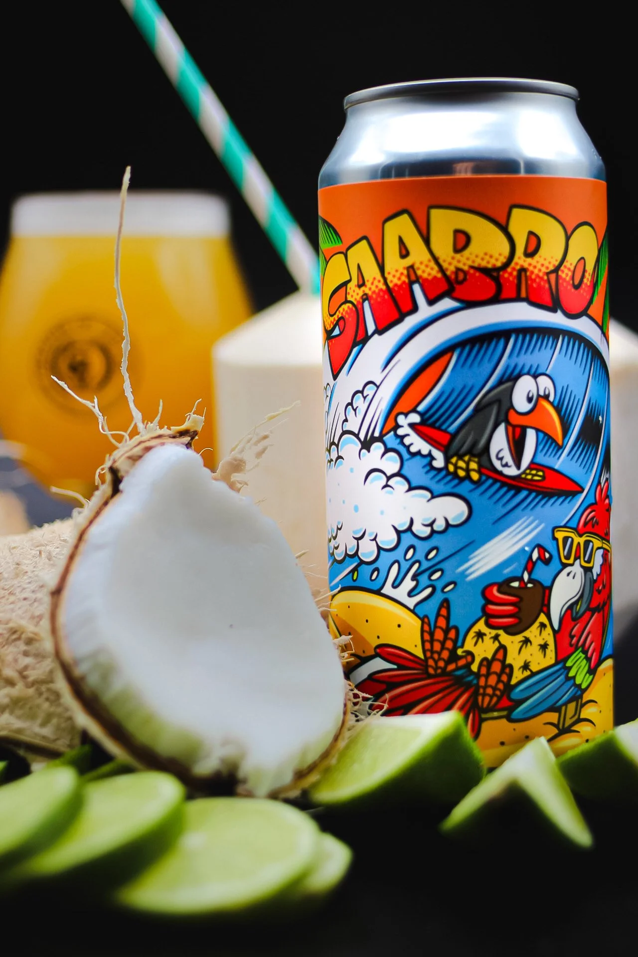
This was fun. I can do whatever I want here, should have just been friendly and surf related. So I sketched this parrot drinking on the beach, with a toucan surfing a cool wave behind him, with a big, bold cartoonish text on top. Cool right?
Slime Time - beer can design
Slime Time. My favorite, for sure. The idea was to create an inspired 80s/90s graphic that could instantly bring you back to Vhs memories and tacky commercials, green monsters and slime everywhere. When I started sketching I thought about making the entire can as a monster, fitting the text stuck on his forehead.
Total Re-Hop beer can design
Pretty easy here right? An hop inside of an hop! Still, one of my favorite, since the graphic it’s simple, but pops out a lot!
Wanna get a customised beer can illustration? Just drop me an email to joetamponi@gmail.com!


