
8 Awesome inspirational color palettes from punk rock records
If you’re a graphic designer/punk rocker/illustrator/painter/wannabe superhero, this is interesting. You might have thought something similar while looking at records:
“ Where the hell do I saw that particular color, I would love to have it here to make some tests” “Woah dude that cover art looks sick, I can’t stop looking at it”.
Well yeah, it’s pretty much what I thought when I wrote this article and when I picked these colours. I grown up listening Nofx, Millencolin and other punk rock stuff so, most of the colors that I always had in mind are from there. Even from some old skateboard decks but, that’s another story and I’m gonna dig into it soon.
Anyway, just a couple of days ago I found out that a blue shade that I love came probably from this cover art, which is a masterpiece. Simple, minimal but awesome.
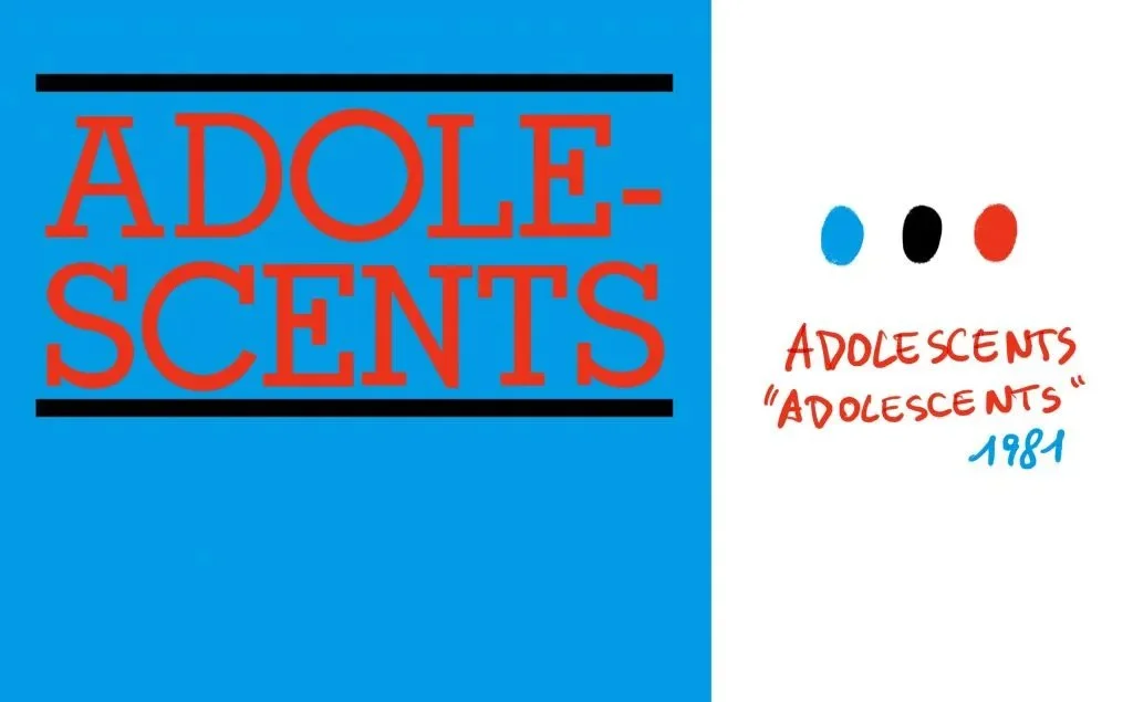
Adolescents - Adolescents / color palette
Look at this one. This is a perfect example of how flat colors and a very minimal illustration could make an incredible visual impact, especially printed.
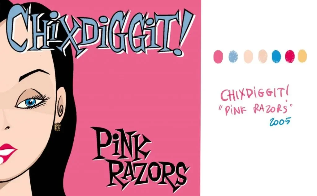
Chixdiggit! - Pink Razors / color palette
How cool is that pink shade, together with the light blue?
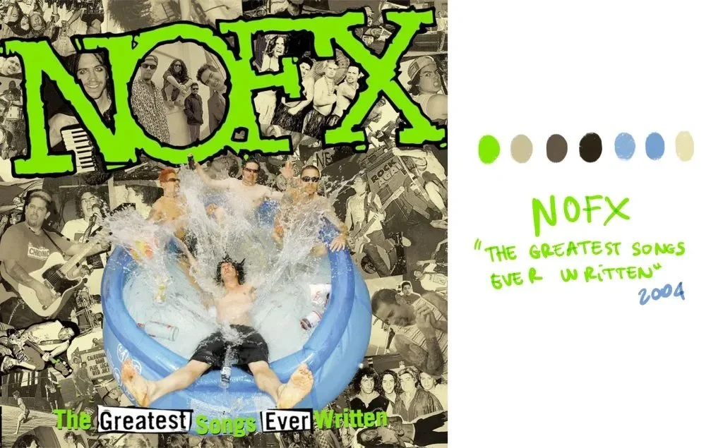
Here I loved the contrast between the black and white/sepia pictures together with that super acid green and light blue of the pool. Made me think about those old 80s zines.
This one’s pretty easy, black background with magenta and yellow. Another example of how you can create something great just using a couple of colors and not a bunch of them all mixed together. When I discovered his band I was stoked. Basically they’re the Descendents without Milo, when he started studying biochemistry.
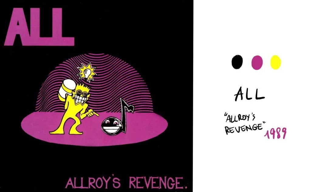
All - Allroy's Revenge / color palette
I always loved this Less Than Jake record and even the cover is awesome. Wanna hear something? You should.
Confusing, chaotic, but with a clean color palette. Sick job.
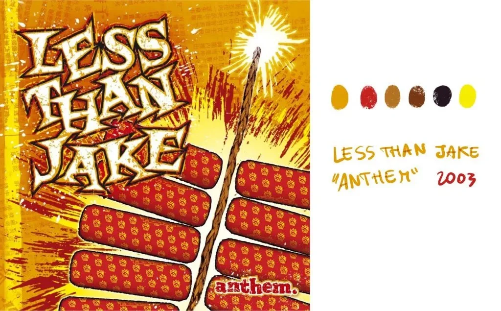
Less Thank Jake - Anthem / color palette
This Nofx album is another masterpiece, I listened Murder the Government at least a million times, and look at the cover:
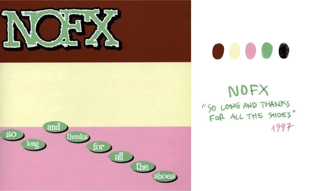
Nofx - So Long and Thanks for all The Shoes / color palette
That pink together with the cream/vanilla and brown it’s basically a tub of ice cream.
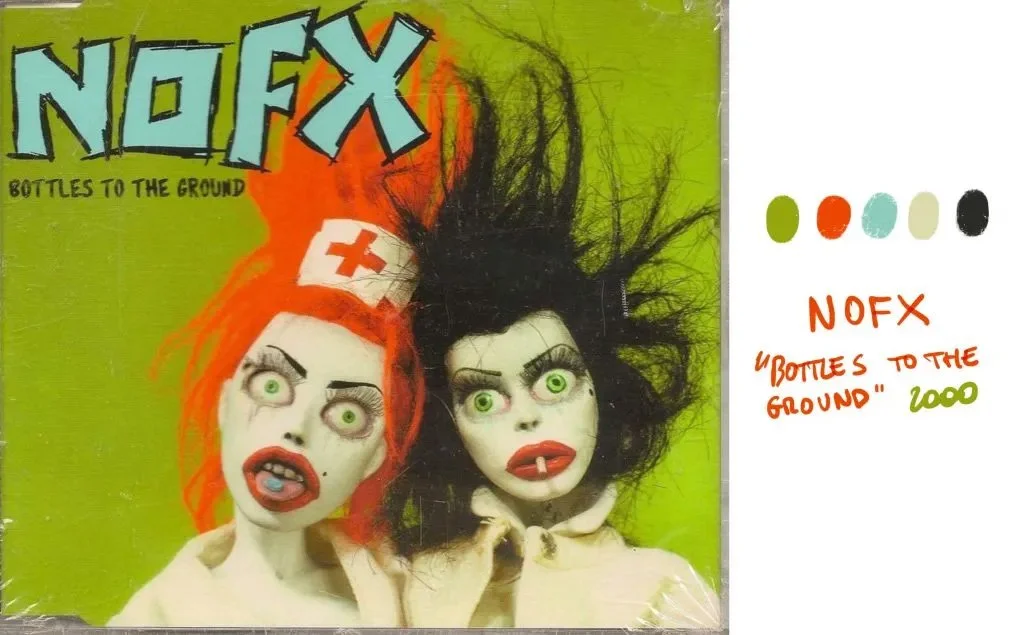
Nofx - Bottle to the Ground / color palette
Here we have a super win. That flashy orange with the acid green background is something that makes you instantly remember this. Simple, but still super eye catchy. Don’t stare it too much or it’s gonna freakin fry your eyes.
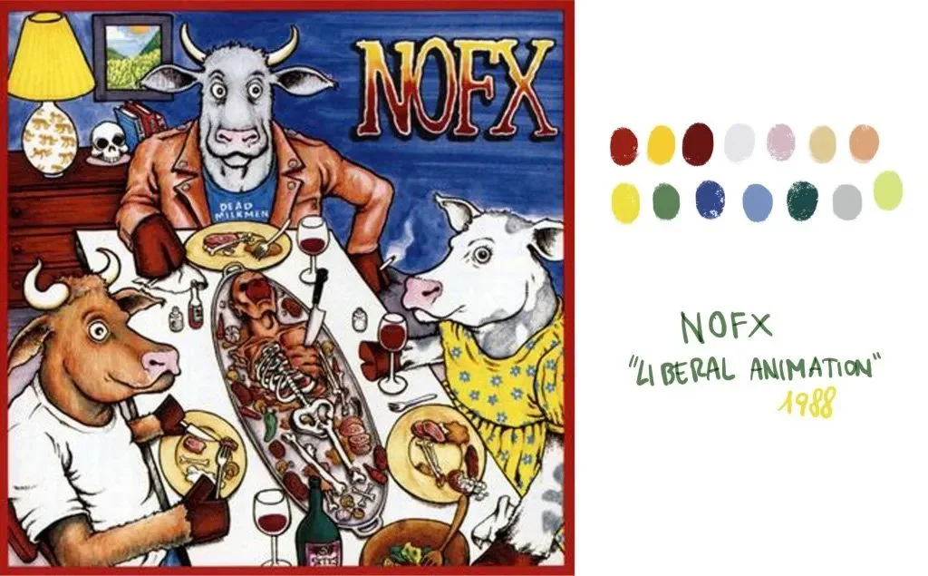
Nofx - Animal Liberation / color palette
I don’t know I just liked it. And there’s also cows eating a human being.